
Beautiful Maps
27 February 2024
Cue Excitement!
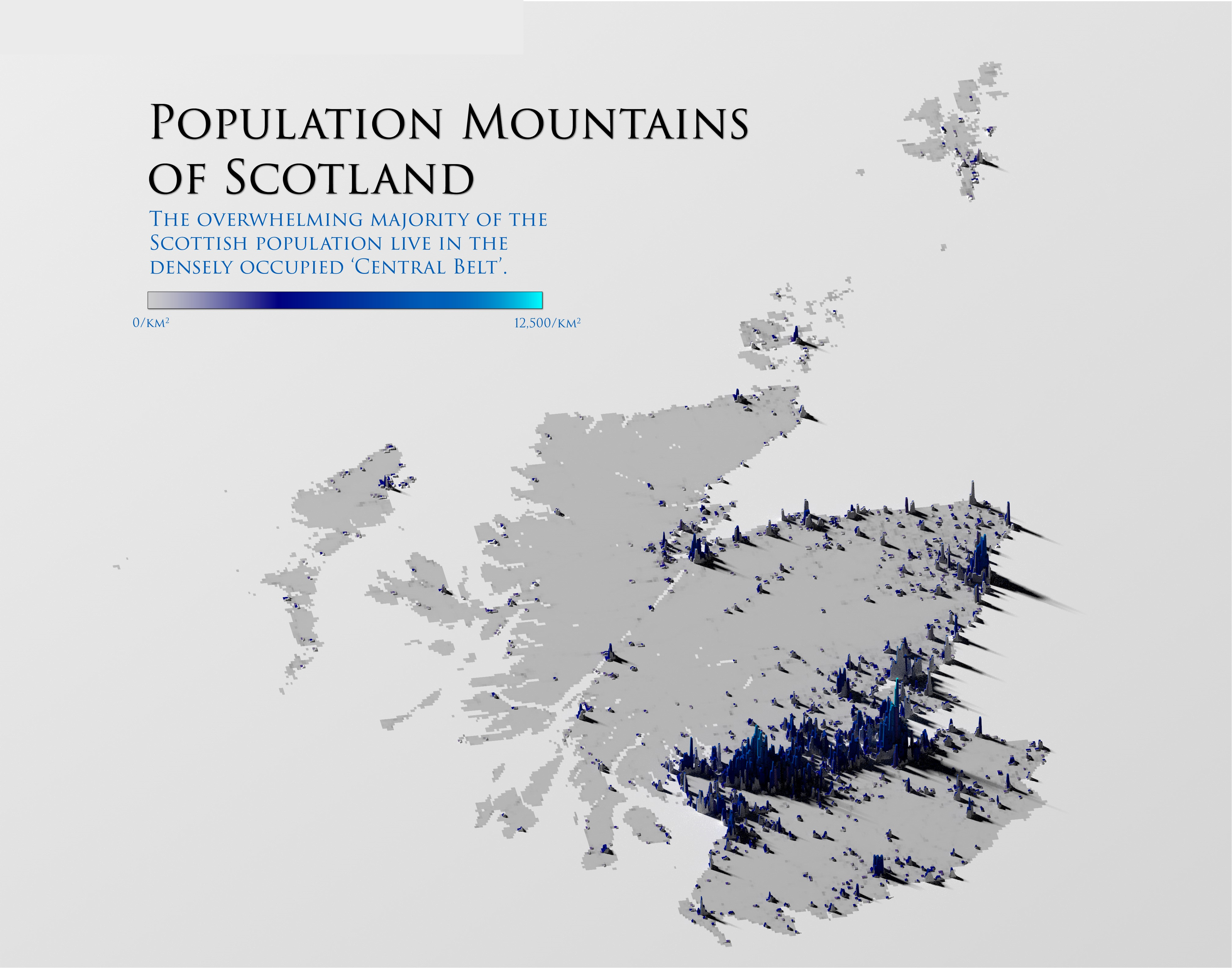
I recently discovered and subsequently posted on LinkedIn an approach to producing 3D maps using the Rayshader package in R. As a massive (read that again: MASSIVE) fan of the Population Mountains piece at pudding.cool, I had to say I was a bit giddy and pretty much instantly tried to produce a similar output for Scotland. Just LOOK at how good that look above!
It turns out that, aside from a the clear nightmare that is required compute, it’s not actually all that difficult. The approach uses TIF files to create the visuals and then Rayshader to really help make them pop. The tutorial is provided by the original architect of the approach, Milos Popovich PhD, but for my own part, I’ve tried to shred the time requirement out and just give the process in digestible code chunks.
Building the Visual
As always, we kick off with some basic housekeeping and library loading. In this approach we have the Tidyverse (don’t we just always?!) but augmented with some of the usual big names in 3D/map visuals. I’ve used sf before in coordinate-type visuals for sure.
1rm(list = ls())
2gc()
3
4##          used (Mb) gc trigger (Mb) max used (Mb)
5## Ncells 524427 28.1    1168161 62.4   660402 35.3
6## Vcells 954319  7.3    8388608 64.0  1769835 13.6
7
8library(tidyverse)
9library(terra)
10library(giscoR)
11library(rayshader)
12library(sf)
The beginning of the process is entirely 2D based, and the maps essentially have to be knitted together to ensure that the visual of choice can be collected. Here, I create a variable, crsLONGLAT, which sets some parameters for the transformation, as well as getting the NUTS border from giscoR. I hadn’t used giscoR prior to this piece, but will definitely do so again. It should be an excellent addition for some of the economic pieces I’ve been working on.
So, to map in the country and it’s borders, then give a quick visual output check:
1crsLONGLAT <- "+proj=longlat +datum=WGS84 +no_defs"
2
3get_country_borders <- function() {
4
5        country_borders <- giscoR::gisco_get_nuts(
6                resolution = "01",
7                nuts_id = "UKM"
8        )
9        return(country_borders)
10
11}
12
13country_borders <- get_country_borders() |>
14        sf::st_transform(crsLONGLAT)
15
16plot(sf::st_geometry(country_borders))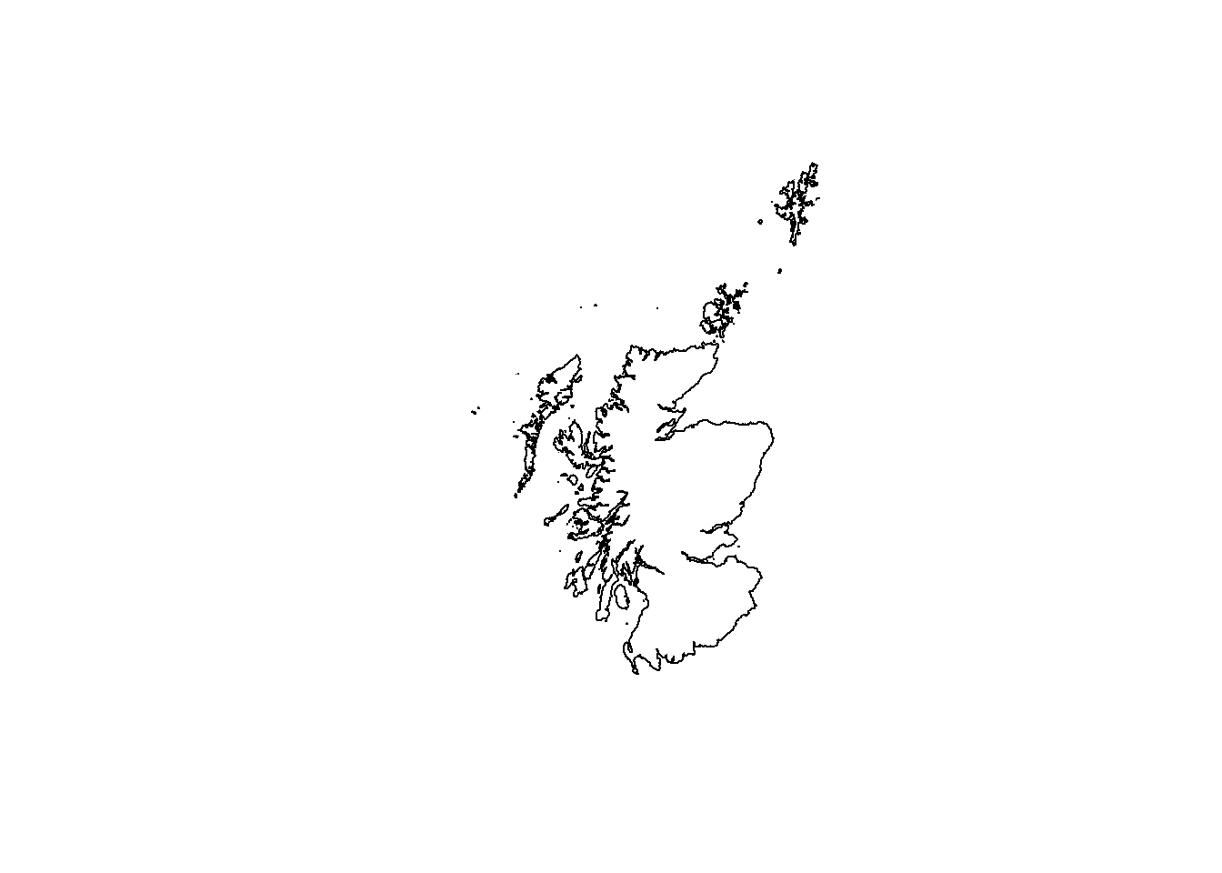
Now, we’ll raster the tif files (of which, in this case, there’s only one) in order to show the visual at the 2D level. We’ll also visualise our ‘mask’ over the top, which will show the area that we’re effectively going to be ‘cutting’.
As an aside, I got the tif files from WorldPop. You should be able to collect what you need from there too.
1raster_files <- list.files(
2        path = paste0(getwd(), "/data/populationScotland"),
3        full.names = T
4)
5
6raster_files
7
8## [1] "C:/Users/jamie/source/repos/Blog/Posts/007-BeautifulMaps/data/populationScotland/gbr_pd_2020_1km_UNadj.tif"
9
10pop_cover <- terra::rast(raster_files)
11
12plot(pop_cover)
13plot(sf::st_geometry(country_borders), add = T)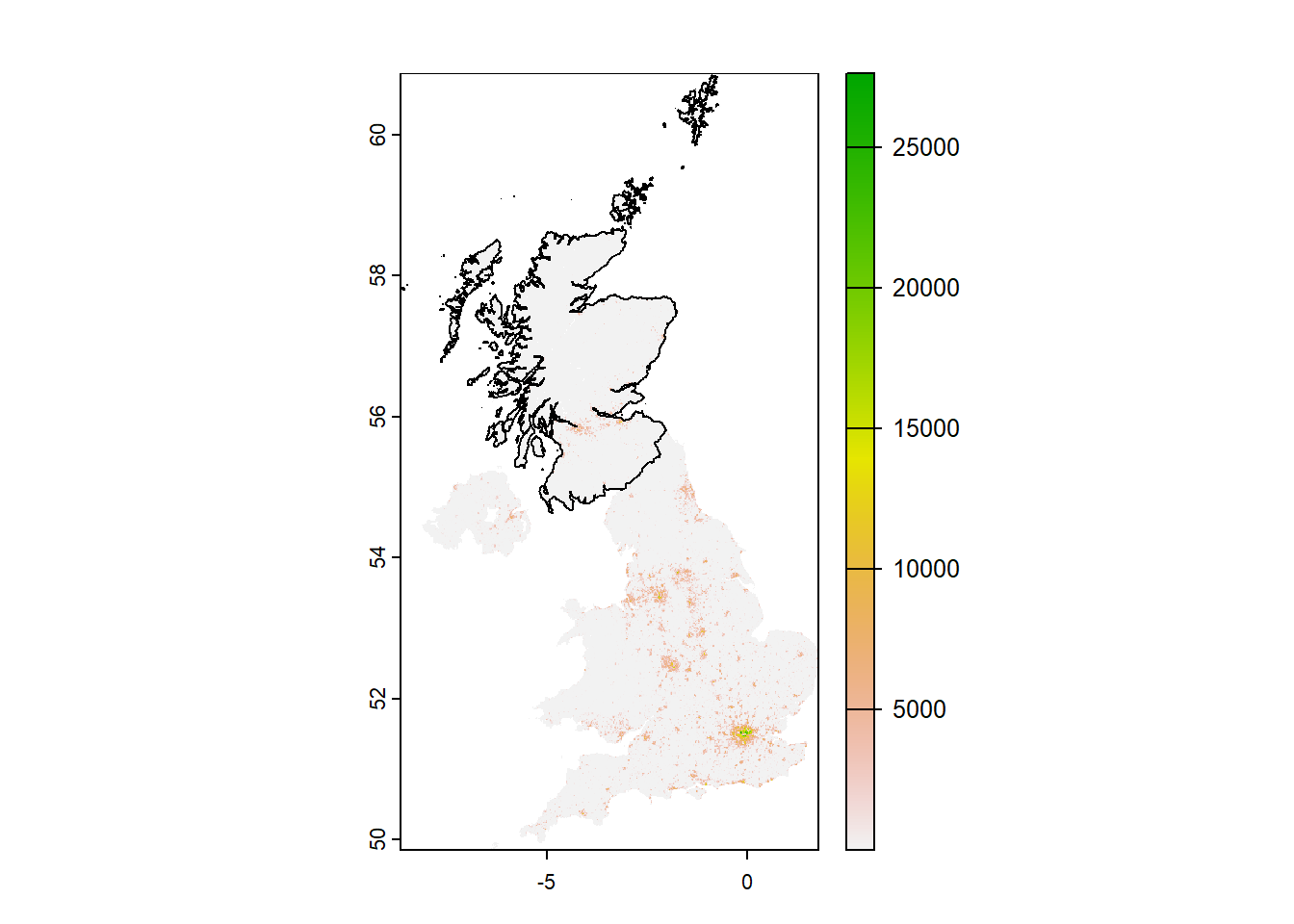
Next, I’m going to create a mask using the country information and crop the visualisation into the specific outline of Scotland. This was actually a surprisingly simplistic thing to do, I thought. The terra package helps here, with the ‘crop’ function.
Note also that the aggregate function below simply aggregates smaller regions together.
1get_pop_cover_cropped <- function() {
2
3        country_borders_vect <- terra::vect(
4                country_borders
5        )
6
7        pop_cover_cropped <- terra::crop(
8                pop_cover,
9                country_borders_vect,
10                snap = "in",
11                mask = T
12        )
13
14        return(pop_cover_cropped)
15}
16
17pop_cover_cropped <- get_pop_cover_cropped() |>
18        terra::aggregate(
19                fact = 2
20        )
The next stage is classic data wrangling. I can create a dataframe of the population values and bake in the X and Y coordinates in order to give us a clearer source of information for the visual. Additionally, I’m organising the maximums and minimums as well as a colour palette to help prune and improve the end visual.
1pop_cover_df <- pop_cover_cropped |>
2        as.data.frame(xy = T)
3
4pop_cover_df %>% glimpse()
5
6## Rows: 42,046
7## Columns: 3
8## $ x                     <dbl> -0.8845833, -0.8679167, -0.8345833, -0.8179167, …
9## $ y                     <dbl> 60.83292, 60.83292, 60.83292, 60.83292, 60.81625…
10## $ gbr_pd_2020_1km_UNadj <dbl> 0.08928708, 0.10267742, 0.34275908, 0.20258824, …
11
12names(pop_cover_df)[3] <- "pop"
13
14## breaks
15
16summary(pop_cover_df$pop)
17
18##      Min.   1st Qu.    Median      Mean   3rd Qu.      Max.
19##     0.023     0.301     1.086    68.567     6.090 12449.495
20
21min_val <- 0
22max_val <- 12500
23limits <- c(min_val, max_val)
24
25breaks <- seq(min_val, max_val, 2500)
26
27## colors
28
29cols <- rev(c("cyan", "#005EB8", "navy"))
30
31texture <- colorRampPalette(cols)(256)
32texture[1:2] <- c('grey80', "grey60")
33
34summary(pop_cover_df)
35
36##        x                 y              pop
37##  Min.   :-8.6013   Min.   :54.65   Min.   :    0.023
38##  1st Qu.:-5.0012   1st Qu.:55.92   1st Qu.:    0.301
39##  Median :-4.1679   Median :56.87   Median :    1.086
40##  Mean   :-4.1906   Mean   :56.85   Mean   :   68.567
41##  3rd Qu.:-3.3013   3rd Qu.:57.55   3rd Qu.:    6.090
42##  Max.   :-0.7679   Max.   :60.83   Max.   :12449.495
Once we’ve got an organised set of data and supporting artifacts, it’s simply a case of producing a ggplot2 graphic object. One thing to note here is the untidiness of the ggplot visual itself. When I first completed this process, I had a much tidier ggplot object, but the end result (ie, the Rayshader 3D version) was all a bit messy. The changes to ggplot here simply make for a better 3D rendering.
1p <- ggplot(pop_cover_df) +
2        geom_raster(aes(x = x, y = y, fill = pop)) +
3        geom_text(aes(x = -8, y = 60, label = "Population Density Map\nof Scotland"), hjust = 0, size = 4.5, color = "navy") +
4        geom_text(aes(x = -8, y = 59.52, label = "The vast majority of the population is\nclustered around the central belt"), hjust = 0, size = 3, color = "grey50") +
5        #geom_sf(data = country_borders, fill = "transparent", color = "black", size = 0.2) +
6        scale_fill_gradientn(
7                name = "Population per Square Kilometre",
8                colors = texture,
9                breaks = breaks,
10                limits = limits,
11                na.value = "grey80"
12        ) +
13        coord_sf(
14                crs = crsLONGLAT
15        ) +
16        guides(
17                fill = guide_legend(
18                        direction = "horizontal",
19                        keyheight = unit(1.25, units = "mm"),
20                        keywidth = unit(5, units = "mm"),
21                        title.position = "top",
22                        label.position = "bottom",
23                        nrow = 1,
24                        byrow = T
25                )
26        ) +
27        theme_minimal() +
28        theme(
29                axis.line = element_blank(),
30                axis.title.x = element_blank(),
31                axis.title.y = element_blank(),
32                axis.text.x = element_blank(),
33                axis.text.y = element_blank(),
34                legend.position = "top",
35                legend.title = element_text(size = 7, color = "grey25"),
36                legend.text = element_text(size = 5, color = "grey25"),
37                panel.grid.minor = element_blank(),
38                panel.grid.major = element_line(color = "white", linewidth = 0),
39                plot.background = element_rect(fill = "white", color = NA),
40                panel.background = element_rect(fill = "white", color = NA),
41                legend.background = element_rect(fill = "white", color = NA),
42                plot.margin = unit(c(t = 0, r = 0, b = 0, l = 0), "lines")
43        ) +
44        labs(
45                title = "",
46                subtitle = "",
47                caption = "",
48                x = "",
49                y = ""
50        )
51
52print(p)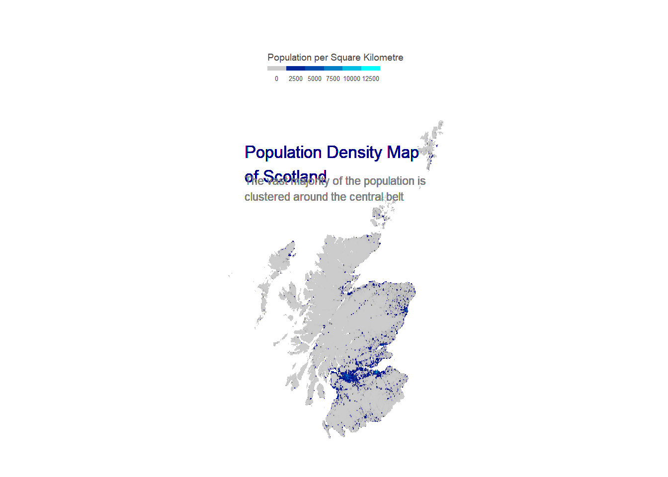
Rendering in 3D
And now, here we are.
Simply take that plot object from ggplot and utilise the plot_gg function in rayshader to produce a 3D, backlit visualisation. Note that this step will produce the visual in a small rgl window, but that it could take quite a long time to render. The first machine I tried this on was running:
- Intel i7-10610U
- 32GB RAM
- Integrated graphics
It took ages - about a half hour or so.
I switched to my desktop running:
- Intel i7-12700F
- 16GB RAM
- nVidia RTX4070 Ti
And it turns out that having dedicated graphics turns it into a 30 second job.
1w <- ncol(pop_cover_cropped)
2h <- nrow(pop_cover_cropped)
3
4rayshader::plot_gg(
5        ggobj = p,
6        multicore = T,
7        width = w / 50,
8        height = h / 50,
9        windowsize = c(1000, 1000),
10        offset_edges = T,
11        shadow_intensity = 0.6,
12        sunangle = 315,
13        phi = 45,
14        theta = -10,
15        zoom = 0.35
16)
17
18rayshader::render_camera(
19        zoom = 0.35,
20        phi = 45,
21        theta = -10
22)
…and then render in high quality…
1rayshader::render_highquality(
2        filename = "outputVisuals/populationScotland.png",
3        lightintensity = 750,
4        preview = T,
5        width = w * 8.5,
6        height = h * 8.5,
7        parallel = T,
8        interactive = F
9)
10
11rgl::close3d()
…and BOOM! We have this absolute beaut!
Hope it works for anybody reading this!