
Napkin Designs
11 February 2025
One of the things that frustrates the life out of me is the lack of clarity that can sometimes be driven from requirements gathering or solution design type sessions. It's nothing deliberate and nobody's fault - but it NEEDS a wisened hand to guide people into gathering good information and understanding the end state of the solution.
There's no industry where I think this is more prevalent than data.
The Issue
In many industries, a technical articulation of an issue followed by a technical document outlining the details of the solution is a fairly standard approach. However, if we look at data in particular, this is all-too-often an incomplete or misinterpreted solution.
Data, and the visualisation of information in particular, is just simply not appropriate for this sort of approach.
The main issue is that this doesn't help "show" what's going to be delivered. Software design as a whole has wireframes for user interfaces and processes, but data rarely follows suit - it's often too difficult or (sometimes) the reporting solutions are pushed back as a lower priority.
I also, being honest, just get a bit frustrated by the apparent 'false professionalism' thing that goes on - like we have to write it in a document to validate it. Why?! In reality, the solution is to be much simpler about what we're trying to build - but there IS a solution.
The Solution: Napkin Designs
Rather than trying to describe it - I'll just show you:
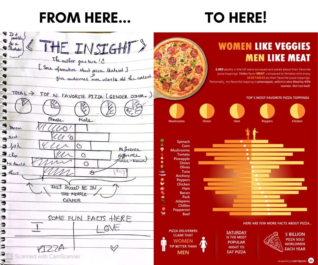
This is an image mercilessly ripped off from Leah Nyugen on LinkedIn, but ultimately, it's a fantastic approach for reporting requirements gathering. I've started calling these napkins, by virtue of many of the sketches looking like a mess drawn on the back of a napkin - but it works!
The number of times I've been working with a client who has verbally articulated their desire, only to get to the point of delivery and roll out the phrase, "oh - that's not what I thought this would look like". Yeah. That's not very useful. Would've been good to have a napkin so we both knew that ahead of time.
While I always advocate doing our best to deliver a draft early and work collaboratively, it is the case that other issues with projects get in the way - but the approach above, simply drawing out the expectation, really helps focus the discussion and show clearly what's going to be expected by both parties at the end.
At no stage is it likely that somebody "didn't expect" to see what was produced, it's likely very close to the napkin.
Another massive benefit is something that I didn't see coming, but it might be the most useful part of the whole discussion. Drawing out the report realistically serves as an effective gap analysis on the overall output. When we draw up a line chart, within reporting standards, and a small table of information, the obvious question to ask is: "let's say your report looks like this, does that give you what you need?"
This is a REMARKABLY powerful question. So frequently there is extension upon extension upon extension across the requirements. We end at a very robust, very clear end state. We still have some documentation highlighting the architecture in general, but reports split this (often silly) literary example and simply have some annotated drawings that everybody can agree on.
The Call to Action
This is simple. The call to action is to stop trying to document reporting outputs in a faux-professional, often wasteful way. Draw up some napkins. Get the expectations clear among all parties. Then, finally, deliver a great solution that really pleases your customer.
Easy, right?